Trade shows are still real opportunities in 2026. Companies spend time, money and energy with the expectation of strong returns. But a lot of people leave frustrated. The booth looked good. The team arrived. But they felt like average results.
If you have ever wondered why that happens, let us explain. Small display errors quietly lessen impact. A clear strategy and smart design make all the difference. This blog discusses five common trade show display mistakes. More importantly, it shows how to fix them. Long story short, better planning means better leads.
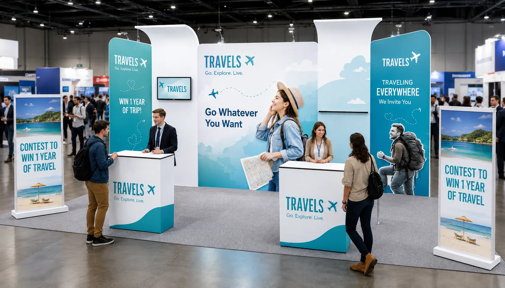
5 Common Trade Show Display Mistakes to Avoid
Related Products


Lack of Clear Goals and Strategy
Most exhibitors start with design and then set goals. They print graphics and make room. They skip the talk about strategy, though.
Do you accept leads? Brand exposure? New product launches? Building relationships? In short, you have to pick a clear focus.
Messaging without direction feels scattered. The staffers offer mixed answers. The visitors are confused. So the engagement level drops.
That’s the idea in a nutshell. First, establish measurable goals. Then build everything around them.
Align booth visuals, talking points and handouts to that purpose. It feels intentional when all the pieces come together. And this is the best part. People want to be clear. They last longer and ask better questions.
Cramped and Cluttered Booth Design
Now, let’s move on to the next point. Many booths try to show everything, all at once. They have too many products. They fill the walls with heavy text. There are banners and screens all over the place.
We get it, you want to show everything. But people can’t bear crowded places.
Trade Show Attendees are Fast. They scan booths in a matter of seconds. So, clean design triumphs.
Think about it this way. Less noise = more concentration.
Use whitespace. The man on the street corner is the strong point of focus. Create specific walking paths. Imagine this for a moment. Visitors will be drawn to a booth that seems open and easy to enter.
Clutter repulses people. They like simplicity.
Inadequate Visual Hierarchy and Branding
Then consider the visibility at 20 feet. If your headline is hard to read, you lose attention right away.
Visual hierarchy is important.
Use bold headlines. Legibility of fonts. Stick to the same brand colors and logos.
But many of the exhibitors blend too many styles. They use small text and fuzzy taglines. This makes branding seem thin.
This is what it all comes down to. Start with a powerful message. Back it up with simple secondary text.
Attendees register. They are guided by clear visuals. They are confused by weak visuals.
Here’s how it all ties together: Branding provides recognition. Recognition is building trust.
Disregarding Booth Size and Layout Optimization
The size of the booth alone does not equal success. A small 10×10 well designed can beat a larger space any day.
But a bad layout is a missed opportunity. Counters guard entrances. Hides important messages. Driving is a bit awkward.
Think of motion. Where do visitors come in? Where does the conversation take place?
Create friendly openings. Position graphics for viewing from multiple angles. Do not use physical barriers.
Now here is the exciting part. Smart layouts drive natural engagement. Small changes in layout improve results.
Confusing or Poor Messaging
Lastly, messaging is what can either make or break you. Generic slogans just won’t cut it anymore.
There are three questions your booth must answer quickly:
- Who are you?
- What’s on offer?
- Why would anyone care?
If not, visitors don’t stay.
Conclusion
Trade shows are a place where preparation and focus pay off. Each of these errors may appear small. But together they reduce the impact.
A good, strategic display will draw people in and initiate meaningful conversations. eBannerSigns can make it happen if you want to build displays with that mindset.


 No products in the cart.